Introduction to Google Analytics
What is Google Analytics?
Analytics works via a small javascript program, that is inserted into every page on a web site. When you visit a web site that has analytics installed the urchin collects data on your usage of that site, this raw data is then fed back to Google. Google then formats the data into meaningful statistics presented on the Analytics dashboard found on the Analytics tab of the Google/Adwords account.
How can Google Analytics help me?
Once analytics has been installed onto a web site, you can use the reporting tool to obtain the following information:
- How customers interact with your site
- How relevant they find your web site
- Shopping cart path abandonment rate
- Numbers and ratio of new to returning customers
- Sources of traffic to your site. (Adwords, Organic, Referring sites, etc)
- Top performing keywords that drive traffic to your site
- Where people are leaving your web site
Accessing Google Analytics
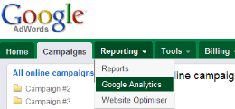
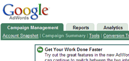
To access Analytics you first need to login to your Adwords account and the click the Analytics Tab. Google has changed where the Analytics tab is located, so we have included screenshots of both locations.

This is the new style login tab

This is the old style login tab
The Google Analytics Dashboard Explained
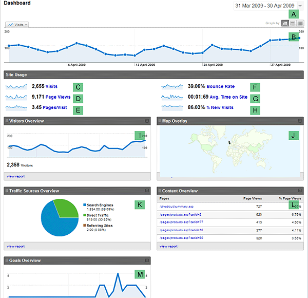
Once logged into analytics this will be the first page you see. Similar to a car dashboard it provides a high level overview of the performance of your website via various metrics displayed as numbers and graphs. It also acts a springboard to various more detailed reports on specific metrics. The page below is what you would see on the ‘default’ settings. You can, if you like, completely customise the dashboard to display whatever metrics you like or those that suit your business needs. For more information on how to do this we suggest watching some of the excellent Analytics Video Tutorials.

Overview of Anayltics Dashboard Metrics
We have labelled the various metrics on the dashboard, explaining what each feature does and a brief explanation of the role it plays.
| Date Range: By default this is set to be a 30 day period ending yesterday. Clicking on the arrow allows you to select the date range via a calender or a timeline slider to update and graph the report data. There is also an option to compare past data. Further instructions on this feature can be found here. |
|
| Graph: The selected date range is viewed as a graph. By default this is set as total number of visitors (both new and returning). If you mouse over the individual dots then you get a precise figure for that metric. If you click on the tab it gives you the option to change segment of the graph, or compare two metrics. See below for the available options. |
|
| Visits The total number of visitors to your website based on the specified date range. | |
| Page Views: The total number of individual web pages that have been viewed on your website based on the specified date range. | |
| Pages per Visit: The average number of pages viewed on your website per visitor based on the specified date range. | |
| Bounce Rate: The % of visitors who only viewed a single page on your website or those who exited your website from the same page they arrived (landing page). This metric can be used to measure visit quality, where a high bounce rate usually means that your customers are not finding this page relevant to what they are looking for. A more relavant landing page will likely result in customers staying on your site and thus increase the likelihood of them converting. Landing pages should provide the information and services that were promised in the ad copy. | |
| Average Time on Site: The average length of time each visitor spends on your site. This is one way of measuring visitor quality. A high figure may mean that customers are interacting with your site. (This figure may be skewed by people leaving the browser windows open, but not actually using the site). | |
| New Visits: Ratio of new visitors to your website compared to return visitors expressed as a percentage. | |
| Visitors Overview: This graph reports the ‘absolute unique visitors’, or the number of new visitors (compared to returning). Clicking on the view report takes you to the visitors overview page. | |
| Map Overlay: The map overlay is used to visualise volume of visitors (visits, pageviews) and quality of visits (pageviews per visit, conversion rate, etc) metrics by geographic regions. You can click on any region to drill down to city level if required. | |
| Traffic Sources: Provides an overview of the source of visitors to your website. The two main categories of traffic source are paid traffic and non paid traffic. Paid traffic is where you have had to pay for each visitor arriving at your site, such as Adwords or banner ads. Non-paid is where customers arrived at your website via the natural listings, a referral from another website (such as a forum) or where customers have typed you web address in directly. Viewing the report allows you to do campaign tracking, where you can view how well the keywords in your adwords campaign are peforming. | |
| Content Overview:The top 5 most commonly viewed webpages on your website. Clicking on the view report link takes you to a more detailed content usage reporting page. There you can get a full list of all the viewed pages on your website and the associated usage of that page, such as bounce rate, length of visit. From here you can tailor individual pages on your website. A page with a high bounce rate may require that page to be redesigned or the ad campaign to be tailored to a more relevant page. A high time on page may indicate that page is interesting. A high number of exits from a non-goal page (or funnel page) may mean that page is confusing or the user is giving up. This is especially important if any high ranking exit pages are in the checkout process. See here for more information from Google on content. | |
| Goals Overview: Will only be displayed if you have configured goals. Goal conversions are the primary metric for accessing how well a site fulfills a business metric on non e-commerce sites. Clicking on the report allows you to view more detailed data about your specified goals and funnels. Goals and funnels can also be used as a metric to indentify any issues in your shopping cart process, as you are able to view visually at what point (and page) in the process customers are exiting. Click here to view more information from Google on the creation of goals. |